Five College Website Style Guide
Style rules for creating pages on this website.
This website style guide offers rules for presenting text that are unique to the Five College website. For general questions of grammar and usage, refer to the Five College Editorial Style Guide. For an overview of the web components available to use on the Five College website, see the Five College Web Components Guide; links for each are in the buttons below, as is a link to training resources for creating pages on the Five College website. For answers to questions not covered here, or to suggest additional points to include, contact Kevin Kennedy.
Organizing a Page
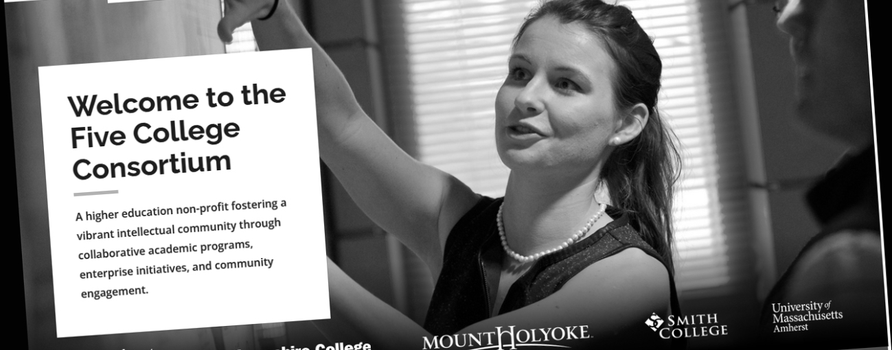
Hero block: All basic pages should have a “hero block” at the top, consisting of a hero image, a title, and intro copy.
Section/container width: When setting up a section, select “small” for container width unless something about the layout requires a wider size (for example, if you need a large anchor block).
Content blocks: Before choosing a content block reference the components guide, and also look at other pages on the Five College site, to get a sense of what will work best. Don’t be afraid to try things that might not work.
Padding/space between content blocks: When configuring a section, select "60px" under "Row padding bottom" in" Layout."
Content alignment: Content immediately under the main “hero” image of a web page should be centered. All other copy should be justified left. “WYSIWYG” is the only web component that will let you choose how to align content.
Titles and headlines: The words in page and section titles should be in title case: the first word and all major words upper case, minor words lower case. With hyphenated words, only capitalize the first word, unless the second word is a proper noun. If using the "title" content block, select alignment left, with a yellow line.
Remove formatting: If copying and pasting content from another source into this website, after pasting it, be sure to select all the pasted text and click the "remove format" button above -- Tx . Not only will this remove formatting, but it will also put the text in the appropriate font. If copying and pasting type from a Word file or other source that may have extensive formatting, consider also using a third-party source for removing formatting, such as striphtml.com.
Photo-naming Conventions

Photos Associated with a Program
If the photo is associated with a specific program, include the program name in the photo name, and also use a very simple description.
For example, this photo, for the Center for East Asian Studies page, is labeled:
CEAS Junk Hong Kong Harbor

Photos not Associated with a Program
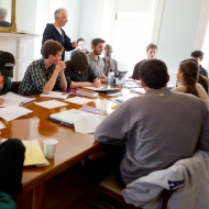
If a photo is not associated with a specific program, just use a descriptor. If it's associated with a campus and you know the name of the campus, include the campus name. This is labeled:
Amherst College classroom 1

Alternative Text Guidelines
Alternative text or “alt text” is the text read by screen readers for the visually impaired. You must create alt text to load a photo on this website. Be simple, be concise: imagine that you’re reading the web page aloud over the phone to someone who needs to understand the page. Avoid using words like “photo” or “icon”; the screen readers announce these automatically. The alt text for this photo is:
A person with long blonde hair looking at a laptop.


